Five ideas for what Candor can become
A visual exploration of the new light-mode experience.
Five ways to picture the same Candor promise
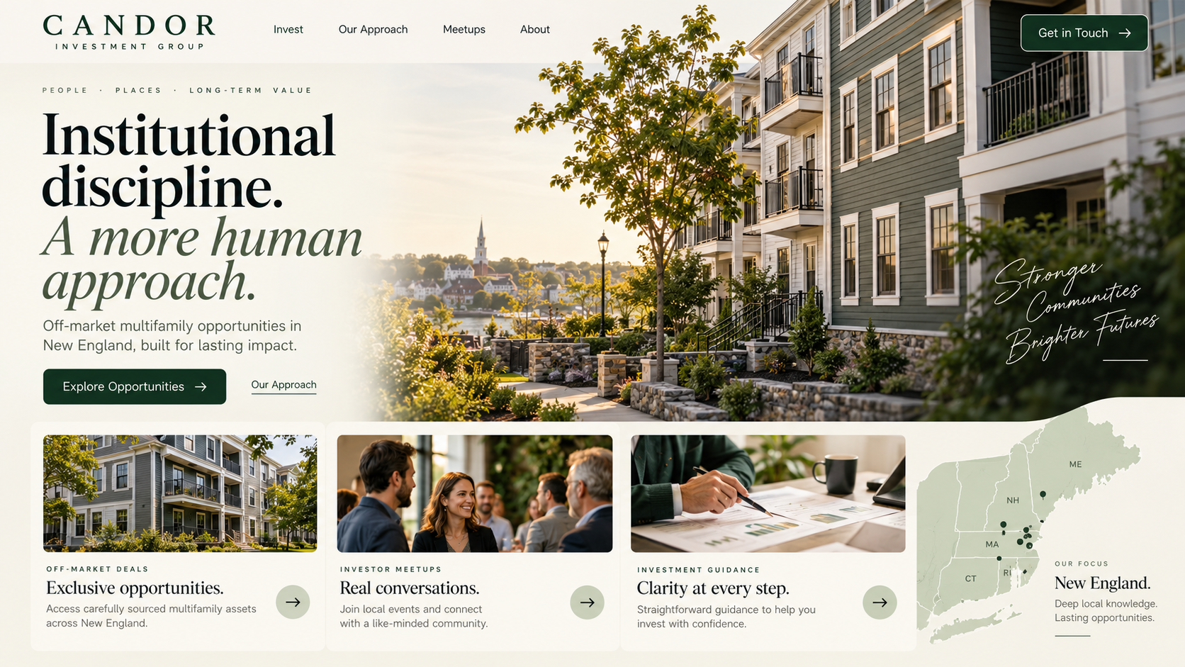
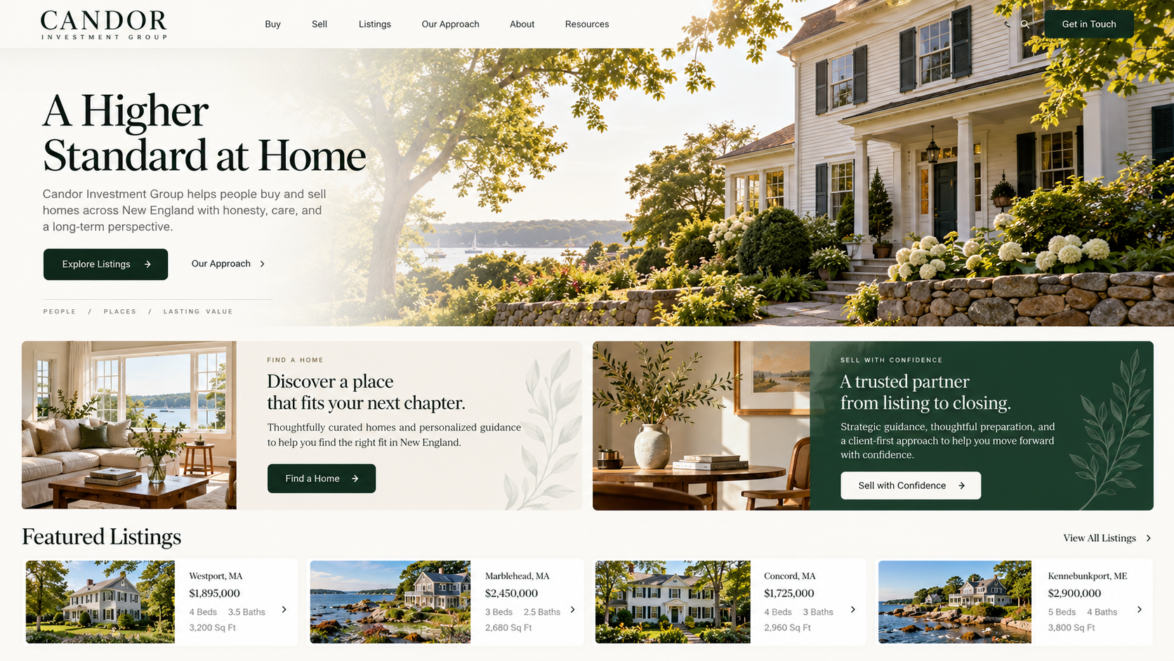
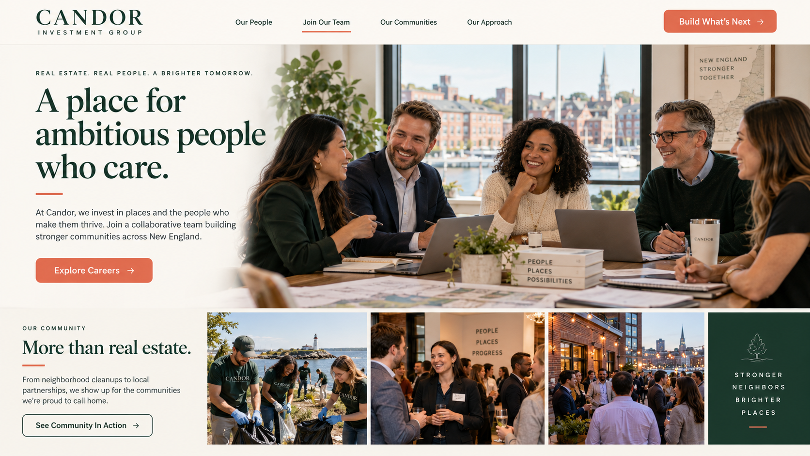
These generated mockups explore layout, rhythm, and mood for a light-mode site. They are design studies, not photographs of actual Candor people or properties.
Start a conversation ↗The desktop homepage
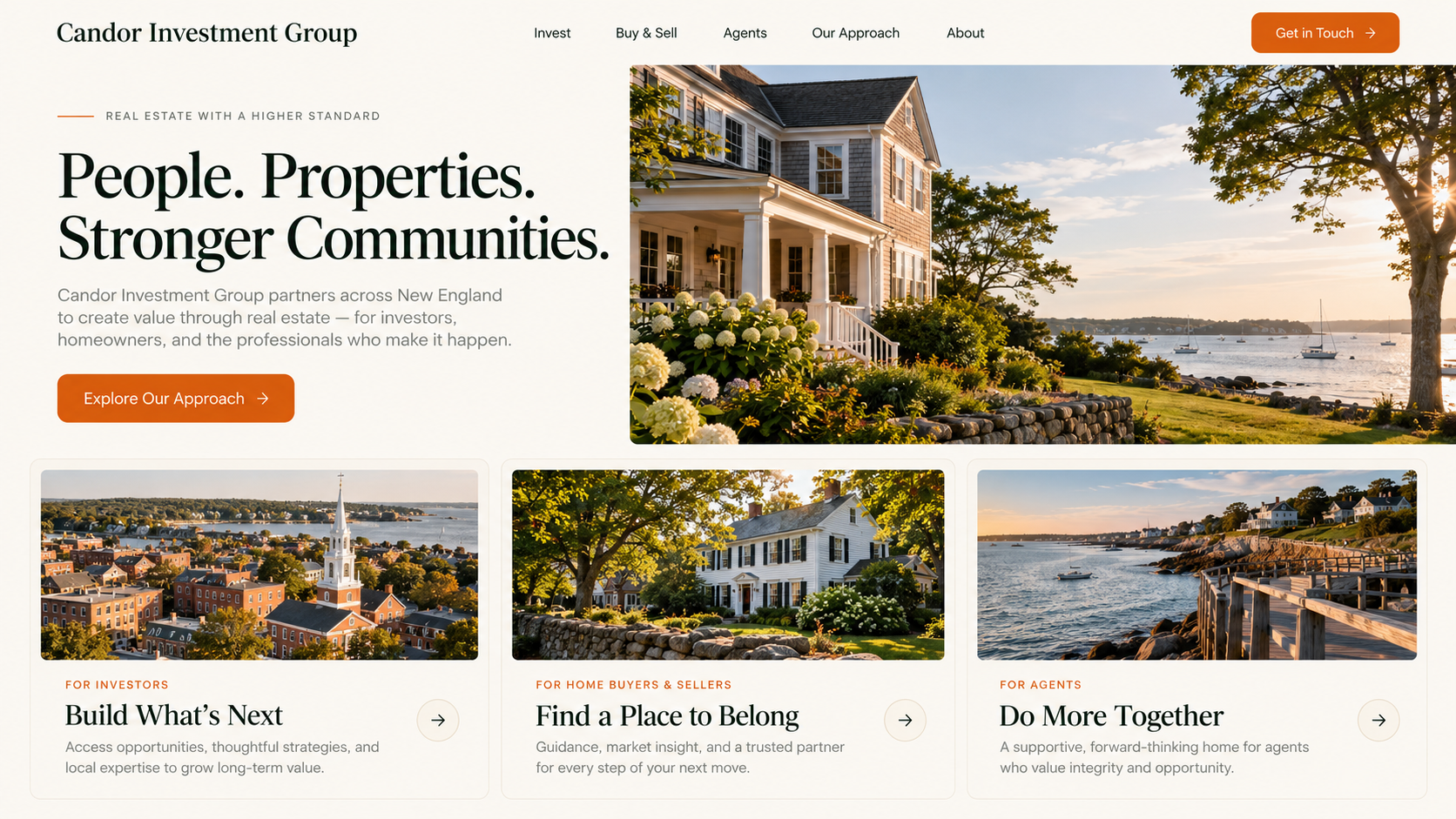
The first concept uses editorial type, open space, and three audience paths. It tests how quickly a visitor can understand where to go without reading a long introduction.
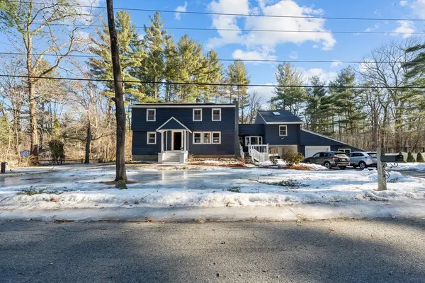
The final site uses Candor’s actual property imagery instead of the concept’s invented houses.
The mobile view
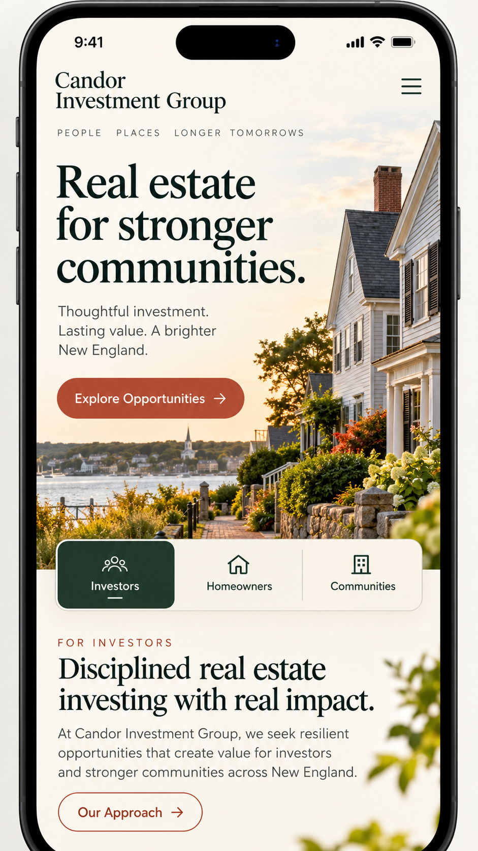
The second concept explores a stronger mobile hero and an obvious thumb-friendly choice among audiences.
On the implemented site, the mobile dock keeps key actions within reach while the full navigation remains available.
The audience pages
The remaining concepts explore an investor guide, a buyer-and-seller journey, and an agent community page. Compare their emphasis, not their fictional details.
The goal is one coherent system that still makes each audience feel seen.
Tell us where you want to go. We’ll help you see the way forward.
One conversation. Clearer options.